Folio design set

Folio report design

The published survey: a serif body, generous white mounts and roundel ratings a first-time buyer can read, with a What happens next panel on the back page.

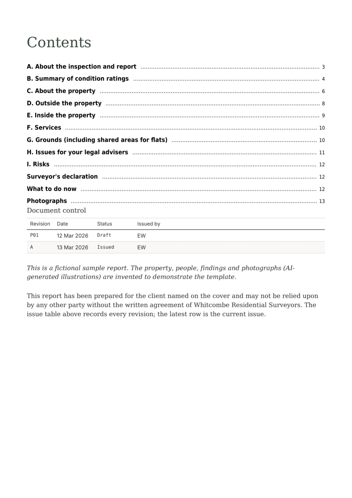
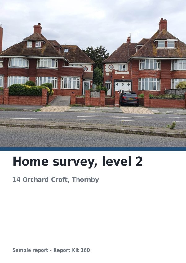
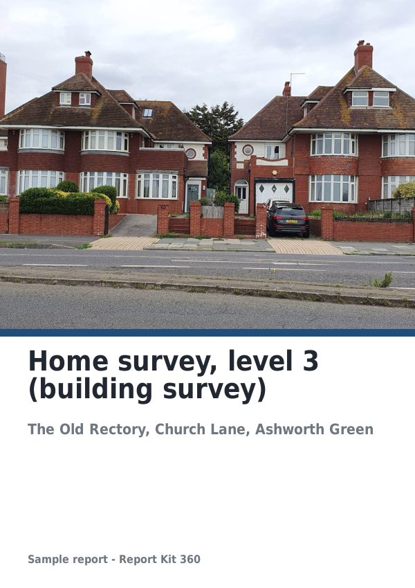
Cover page of the Folio report design specimen
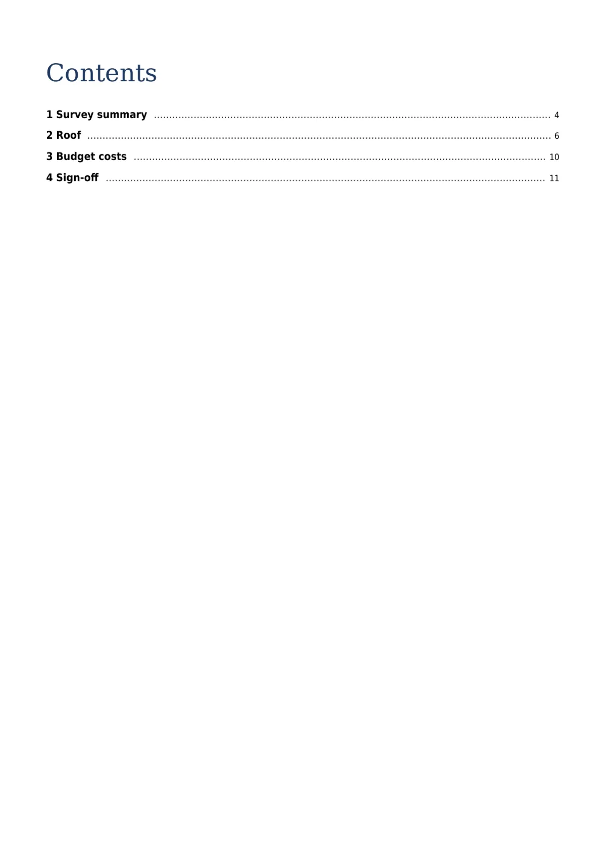
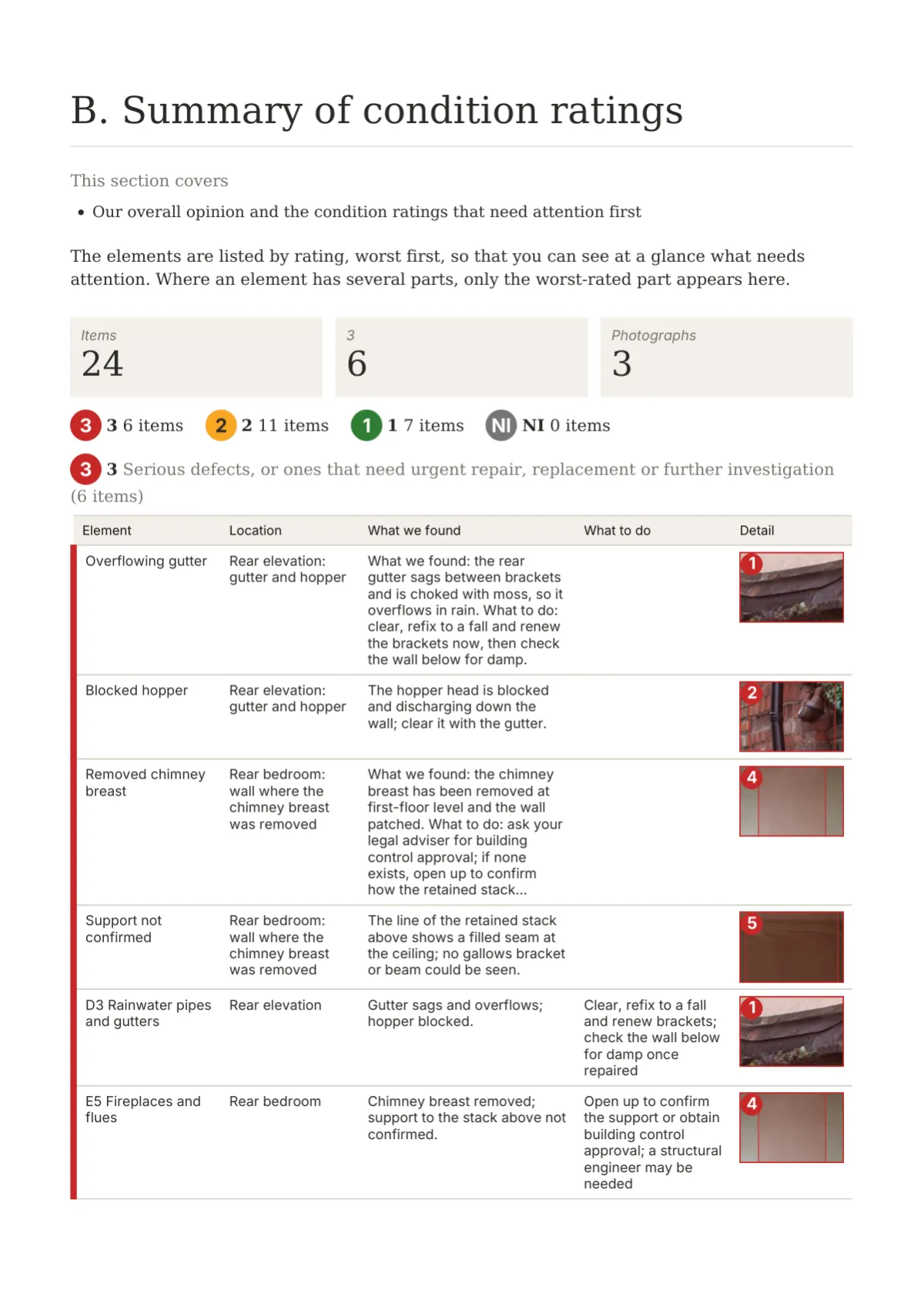
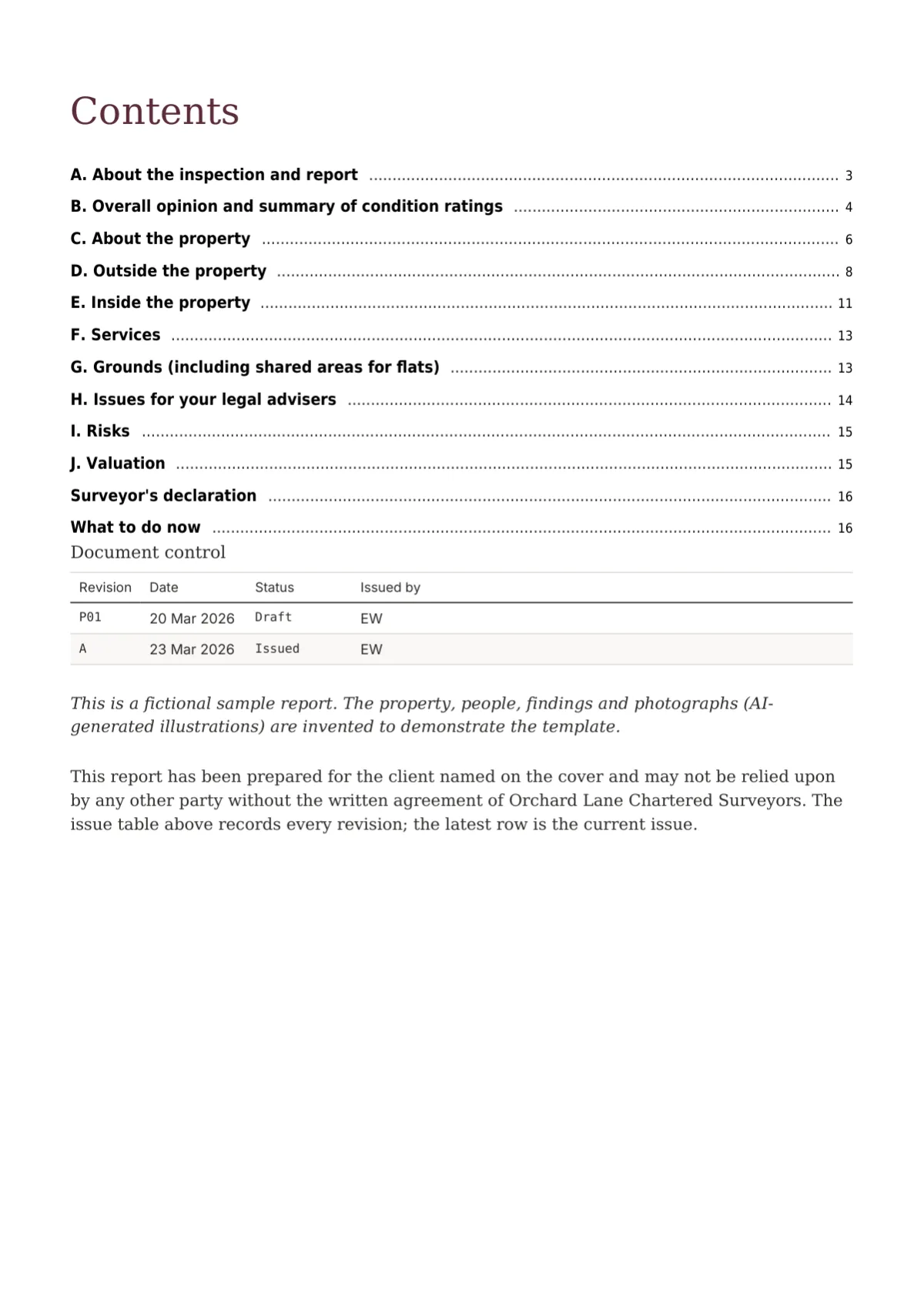
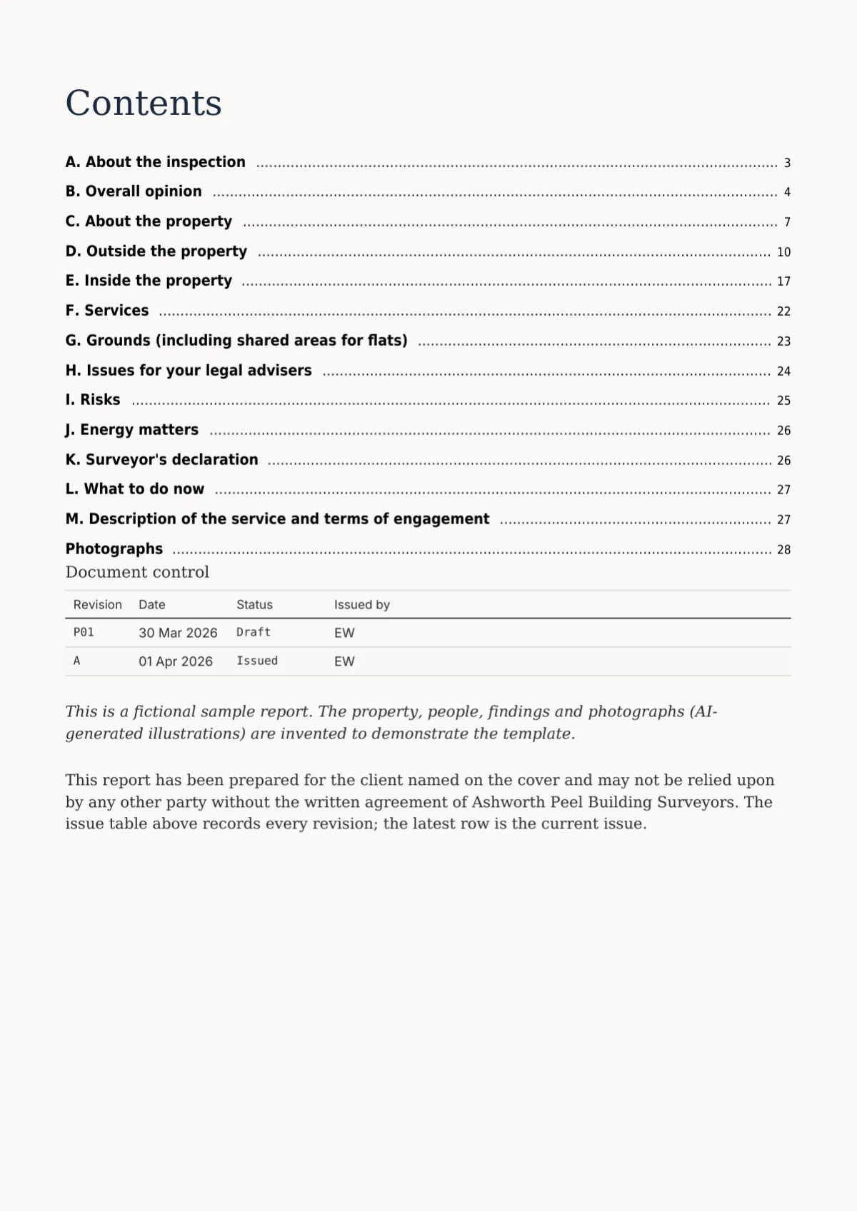
Contents page of the Folio report design specimen
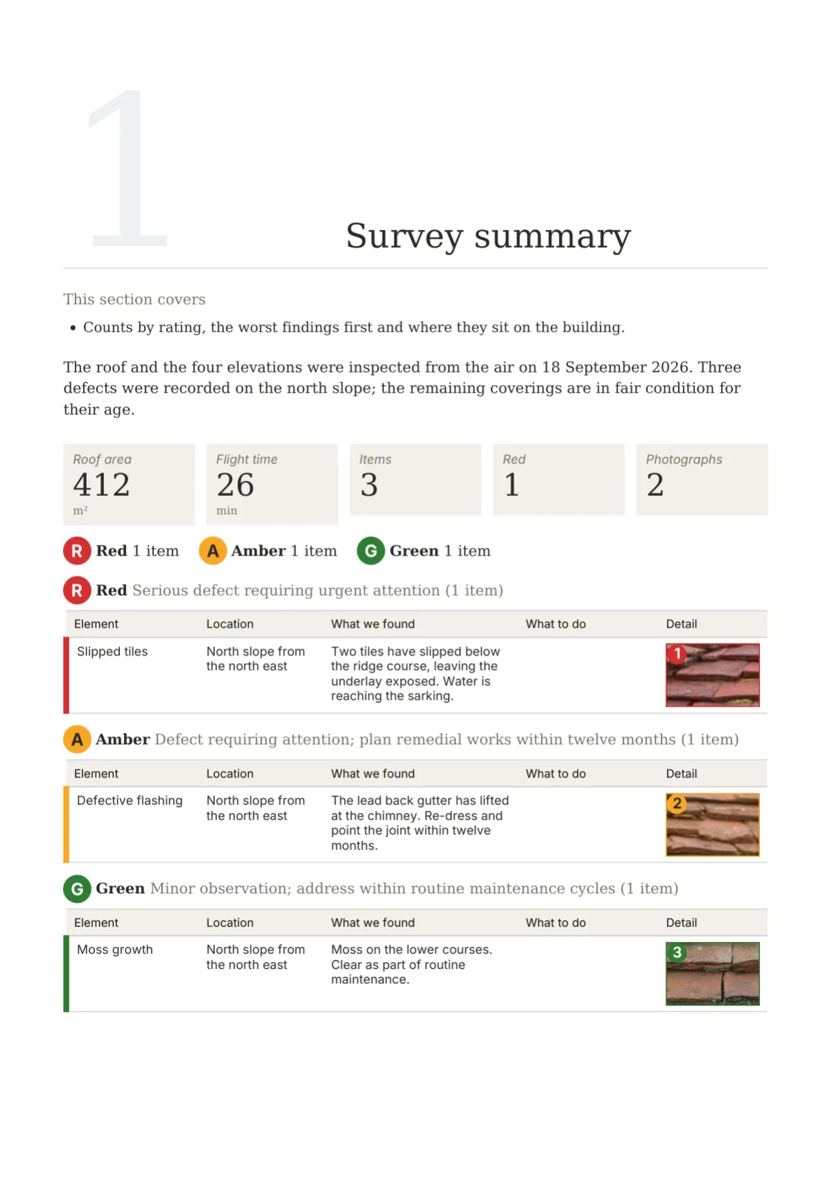
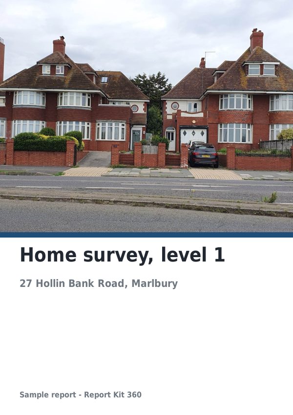
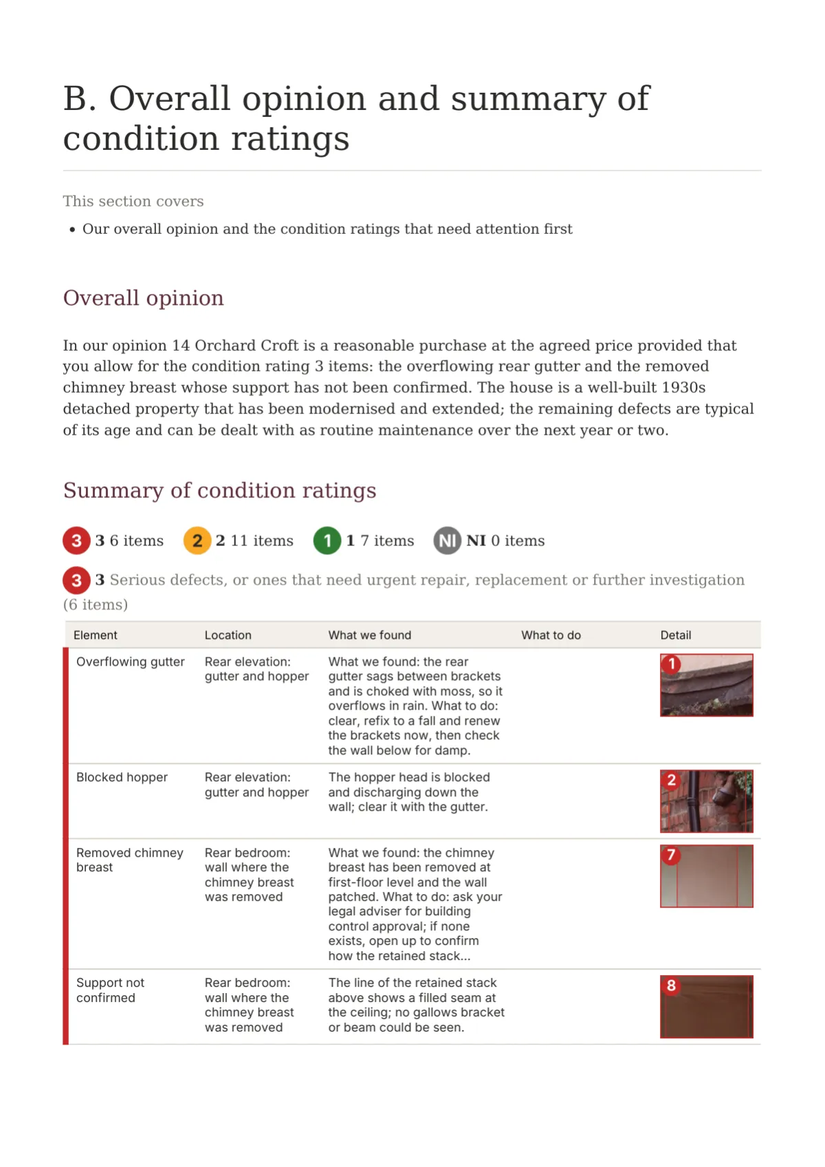
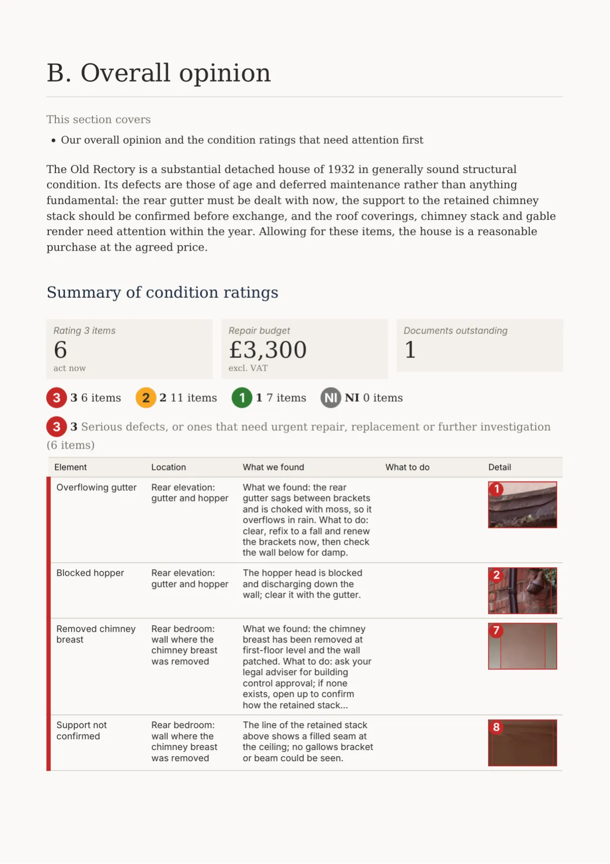
Summary page of the Folio report design specimen

Personality

A home survey report layout written for the buyer

Folio is the set for reports read by people who do not read reports for a living: home buyers and their conveyancers. The body is Source Serif 4 at 10.5 pt with generous line height, labels and tables switch to Inter so small type stays crisp, and there are no frames, bands or grids. The accent is a single tinted numeral, 150 pt high, behind each section opener.

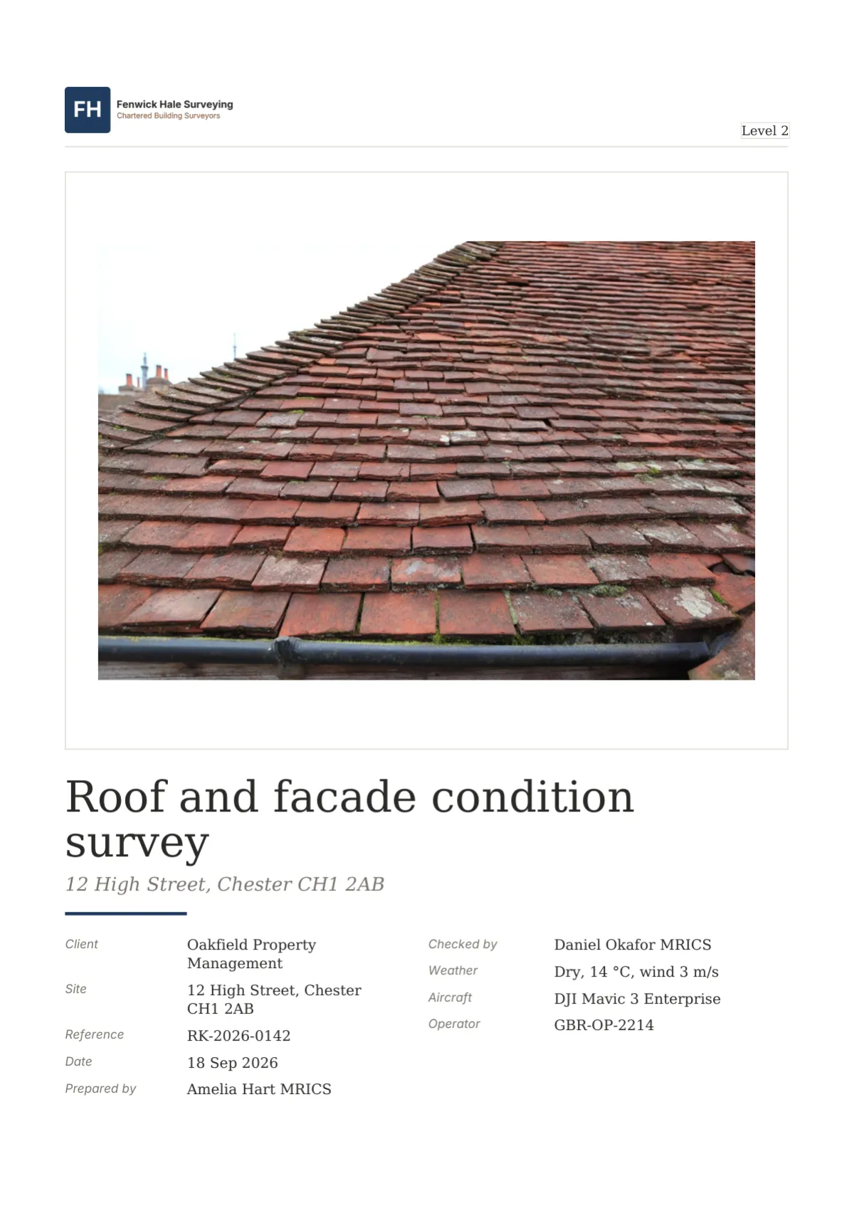
The cover mounts the photograph in an 8 mm white border, landscape photographs full width and portrait ones set left with the title stack beside them. Fields run in two columns under a short primary rule, the roundel counts follow, and a badge such as Level 2 sits as a serif tab. The back page carries the firm, a What happens next panel, the QR code and the limitations.

Ratings are roundels, 7 mm circles filled in the scheme colour with the numeral inside, and schedule rows carry only a thin stripe of colour on their edge. Photographs sit in 6 mm mounts with a crop list beneath: a 48 mm crop, the roundel, the fault in bold and the action in italic per marker. It suits levels 1 to 3, heritage reports and any document a lay client will keep.

Element tour

Twelve elements of the Folio design

Cropped from the specimen report at 1600 px, on white paper. The level 3 sample shows the same set on cream.

Cover page of the Folio report design specimen

Page 1. Survey report cover page: logo top left over a hairline, the photograph in an 8 mm mount, Source Serif 4 Bold title, fields in two columns and the roundel counts row.

Contents page of the Folio report design specimen

Page 2. Dotted contents: serif entries with leader dots, level 2 indented, appendices after a hairline, document control as a small ruled table beneath.

Summary page of the Folio report design specimen

Page 3. Roundel strip, then one grouped table per class worst first, each introduced by its roundel and meaning, with a Detail crop column.

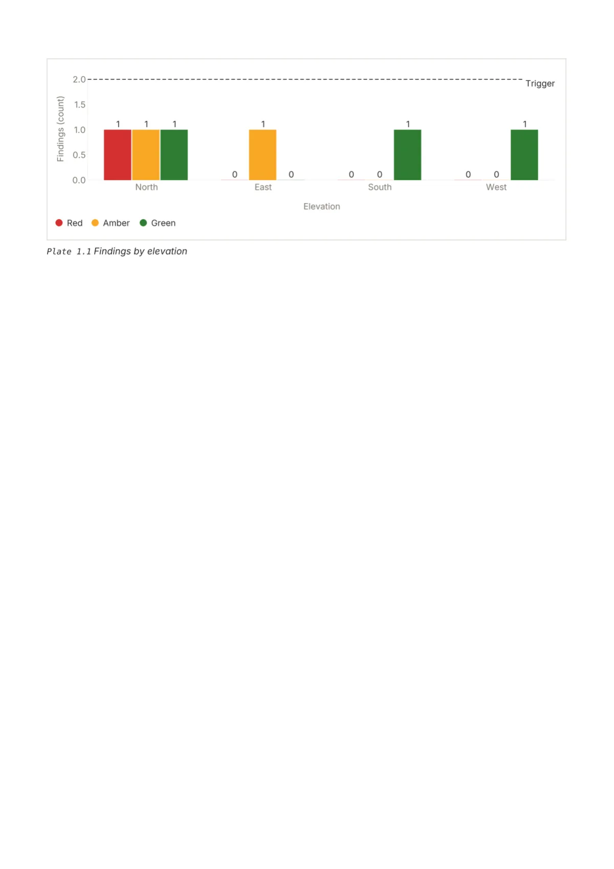
Plate page page of the Folio report design specimen

Page 5. Defect photo crop list: PLATE 2.1 in tracked Inter above the mount, roundel tags on the photograph, one row per marker with a 48 mm crop in its own mount.

Table page page of the Folio report design specimen

Page 7. Serif zebra table in Inter 9 pt: no header fill, hairline above and 0.3 mm rule beneath, zebra rows in the mount tint, totals in Bold over a primary rule.

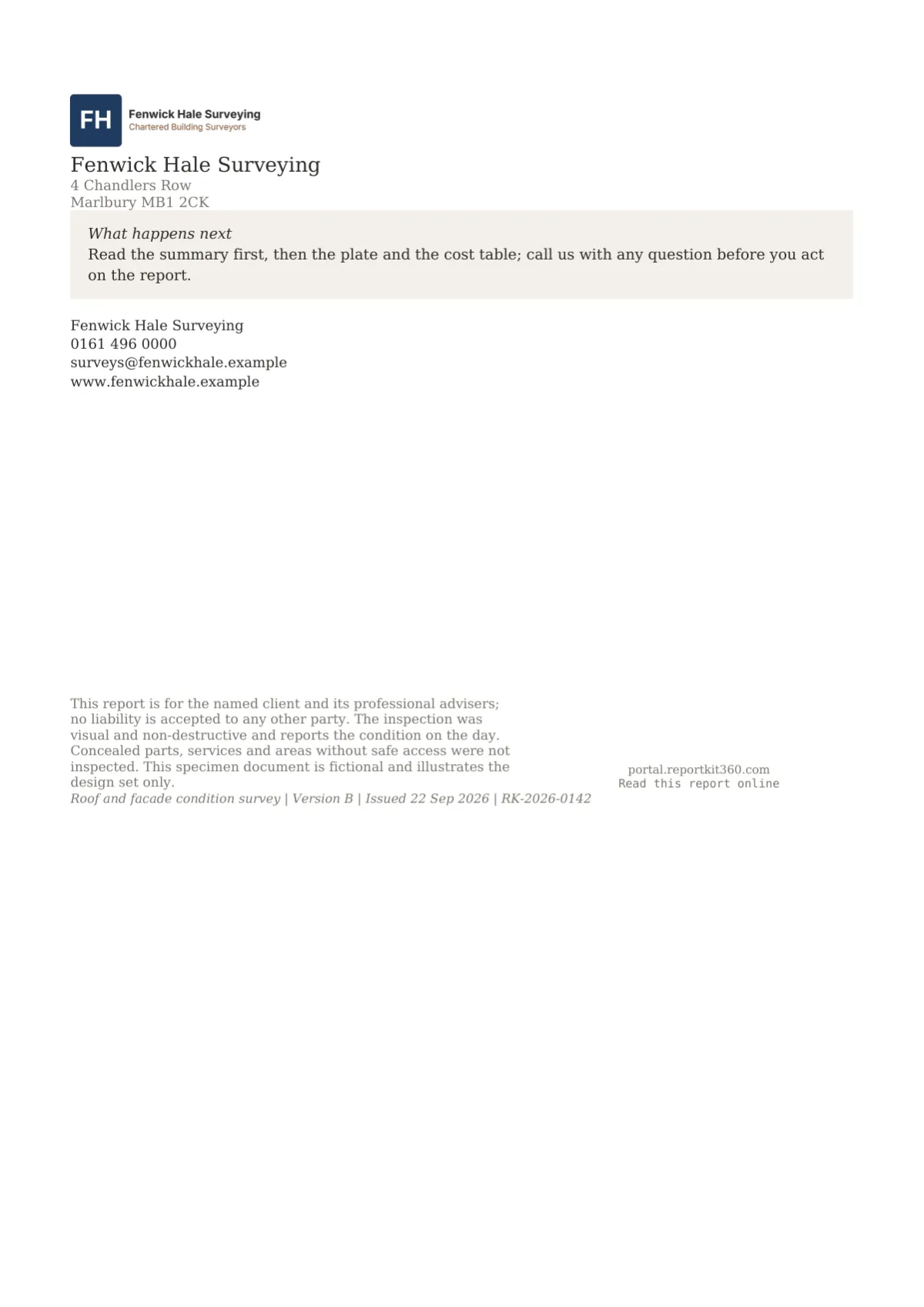
Back page page of the Folio report design specimen

Page 9. Folio back page: logo centred, firm name and address in serif, the What happens next panel, contact lines, a 24 mm QR with Read this report online.

In a full report

See the Folio design in three sample reports

The three RICS-style home survey samples, from the 16-page condition report to the 26-page building survey on cream.

How to use it

Pick the set on Basic, tune every element on Pro

On Basic you choose Folio in the Design step, add your logo and primary colour, and the mounts, roundels and running tab follow; the Report Kit 360 mark sits on a small tile under the cover fields and in the footer strip. On Pro you can switch to cream paper, clone the set and change any element: a ruled contents, a full-page opener, a crop table instead of the crop list, or a different rating shape. The level 2 sample is available as a PDF.

Questions

Frequently asked questions

Yes, on both plans. The logo sits top left on the cover at 14 mm tall with a hairline beneath it, and centred on the back page. Upload it under Settings, Branding as a PNG, JPG or WebP; a version with a transparent background suits the white or cream paper.

Your workspace accent becomes the set’s primary, which colours the opener numeral, headings, the cover rule, callout rules and chart tints. The suggested primary is a muted green-grey, #3B4A3F, that stays quiet beside the rating colours; a stronger brand colour works too, because it is used sparingly.

Yes. The share page is produced by the same renderer, so the mounts, roundels, stripes and crop lists are identical, and the tinted numeral behind each opener is drawn in the browser too. Pagination differs because a browser scrolls, so the running head is a PDF-only element.

On Pro, yes. Clone Folio and choose stamps, tiles, scale bands or tags for the rating badge, with the counts and summary styles set separately. On Basic the roundels are part of the set. The colours come from the template’s rating scheme, so a 3 stays the same colour whatever its shape.

Cream, #FBFAF7, is a Pro option on Folio. It sets the page background while plates, tiles and tables keep white mounts so photographs never look yellowed. On most office printers it comes out as a faint grey, which the theme editor warns about; it reads as intended on screen and on a commercial print.

Next step

Your next report, start to finish.

Pick a plan, add your logo, and issue your first report today.

Choose a plan