Report designs
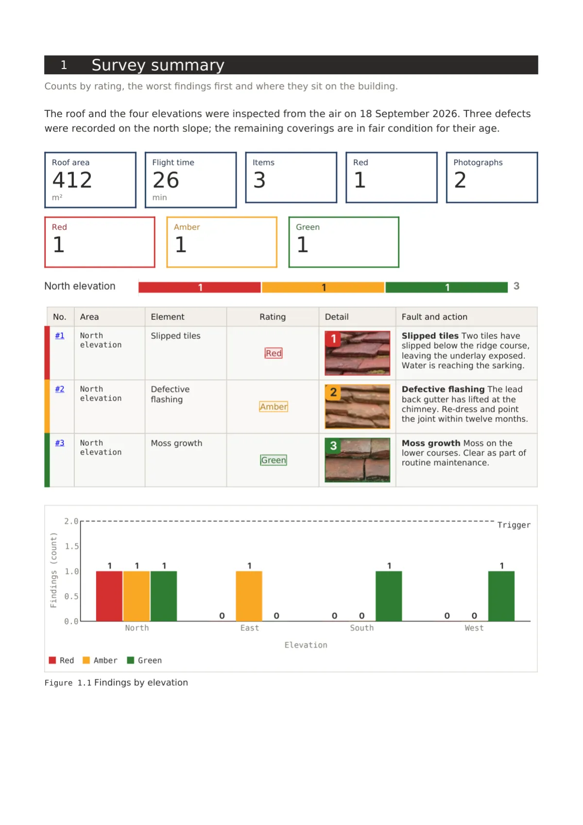
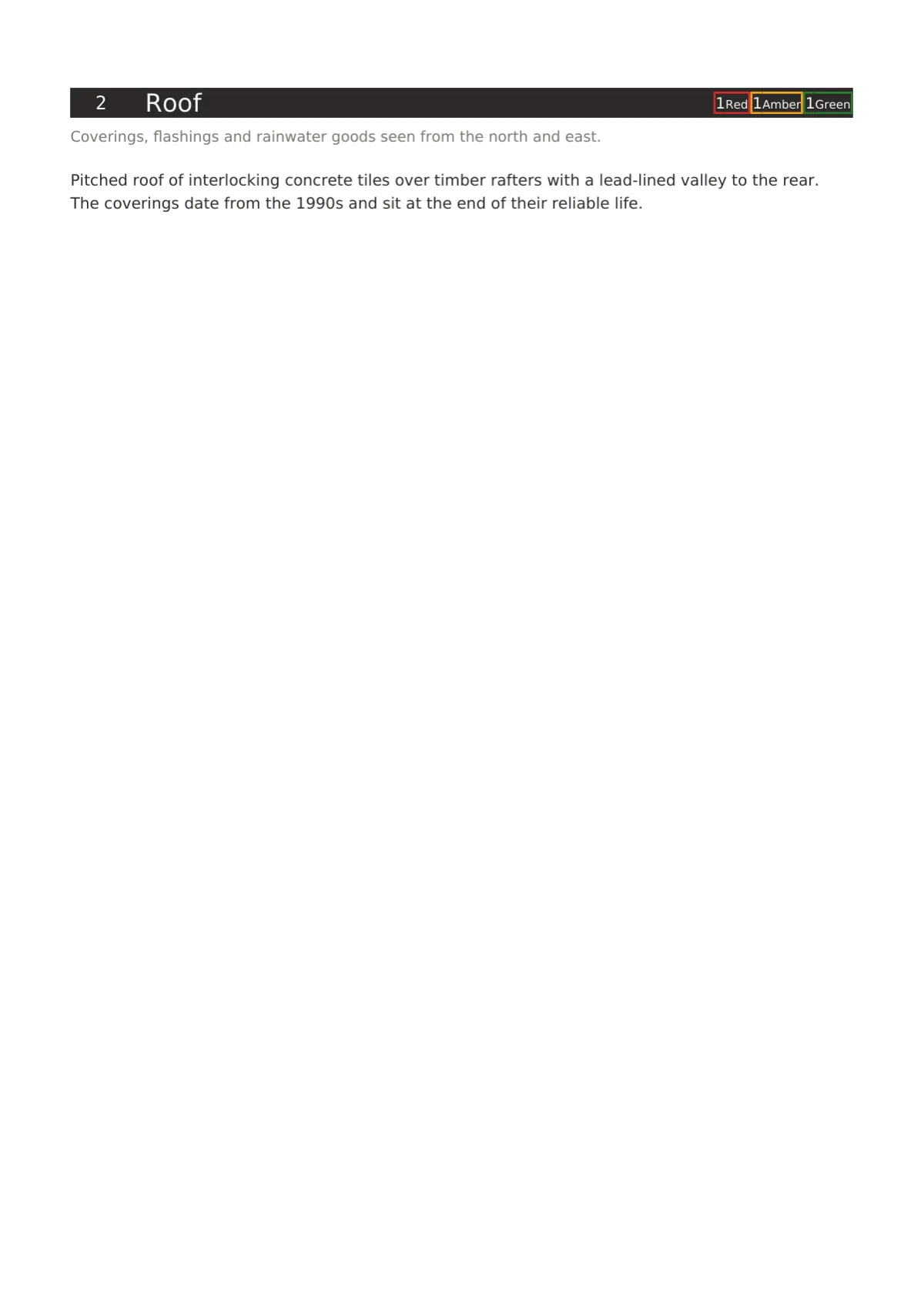
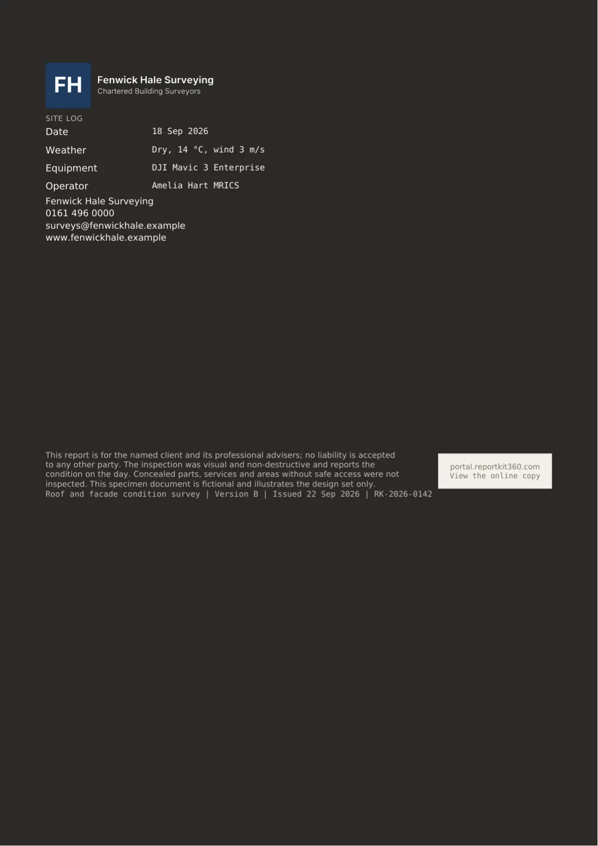
Five complete designs that change how a report is read, not just how it is coloured: the cover, the section openers, the tables, the rating element, the photograph pages and the back page.
Why layout matters
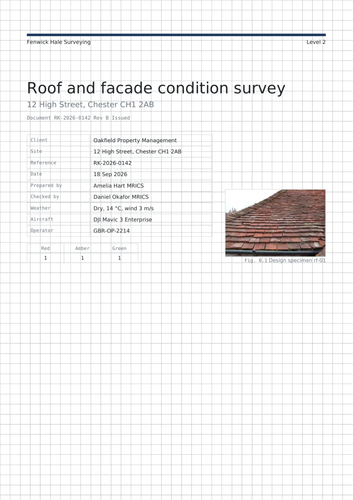
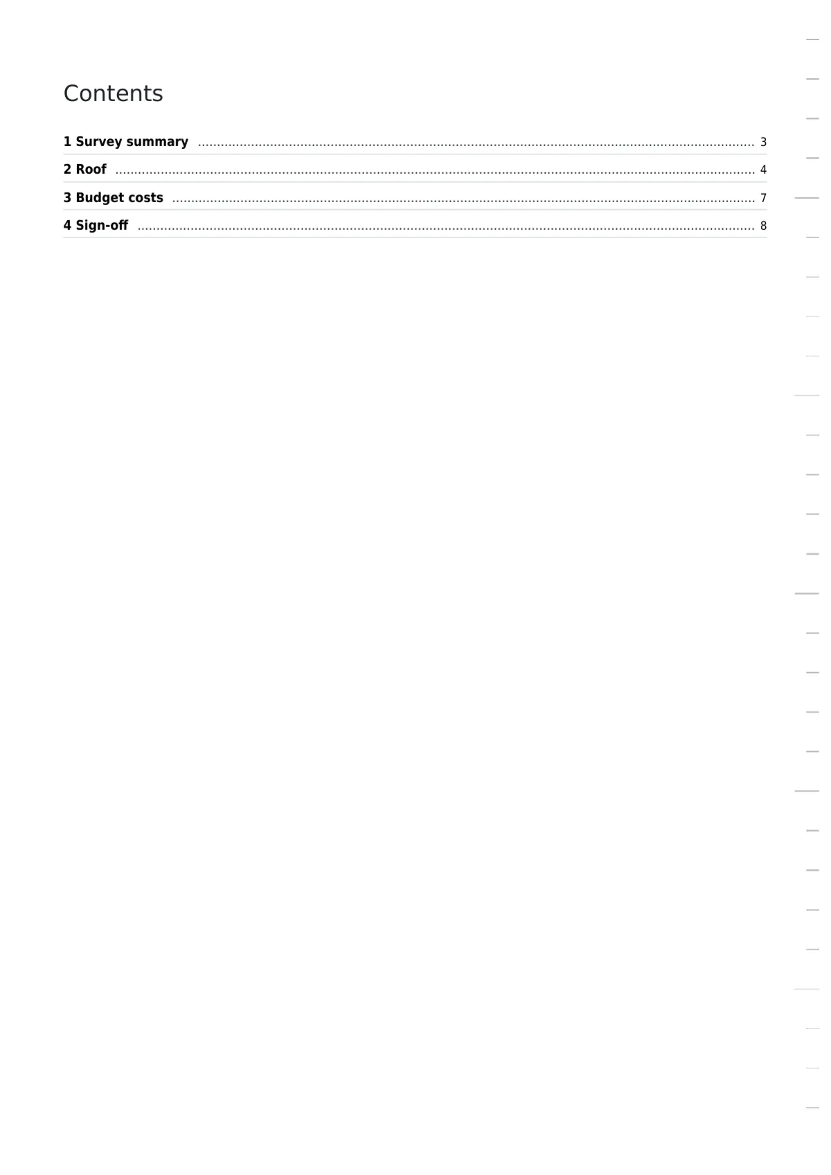
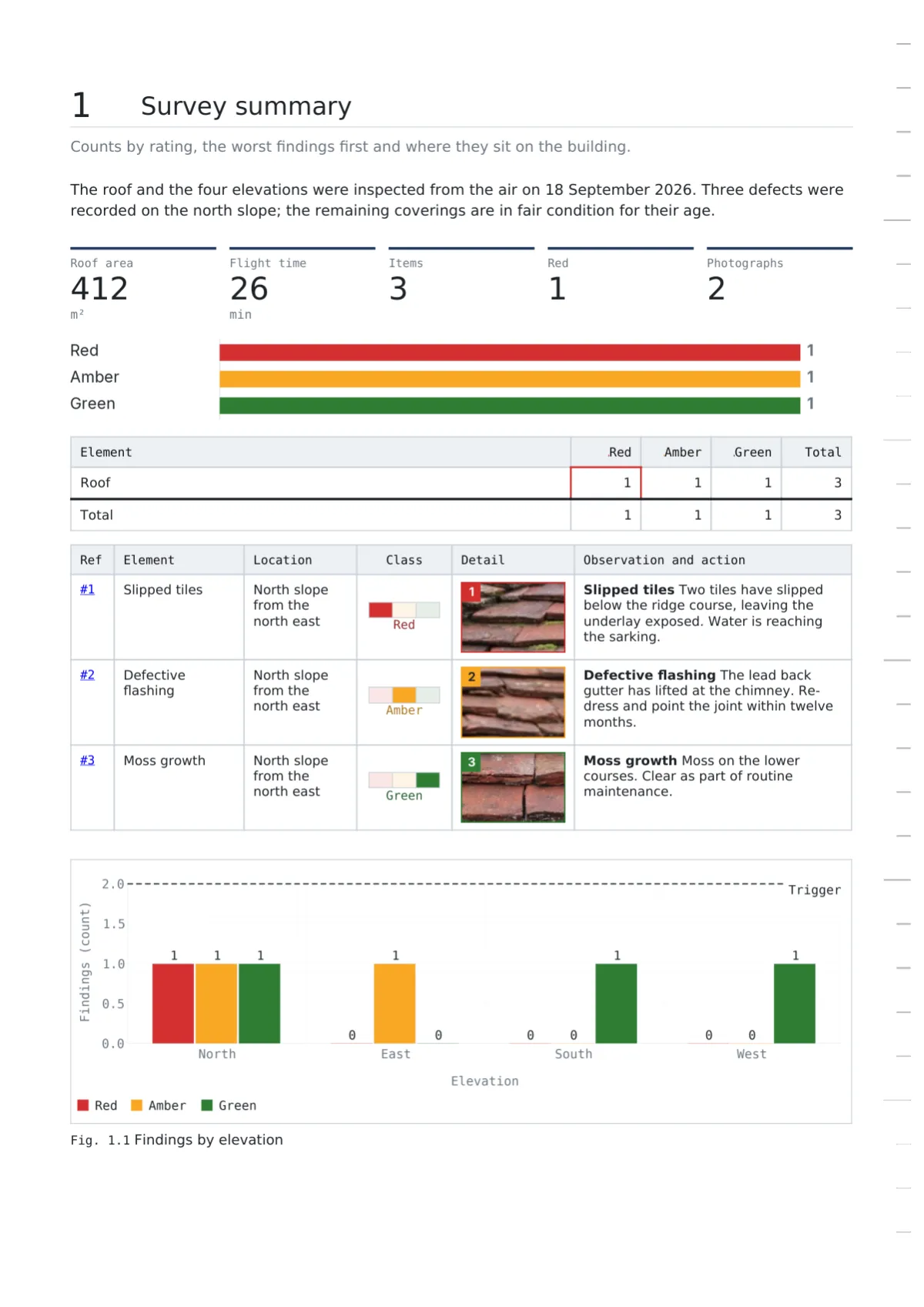
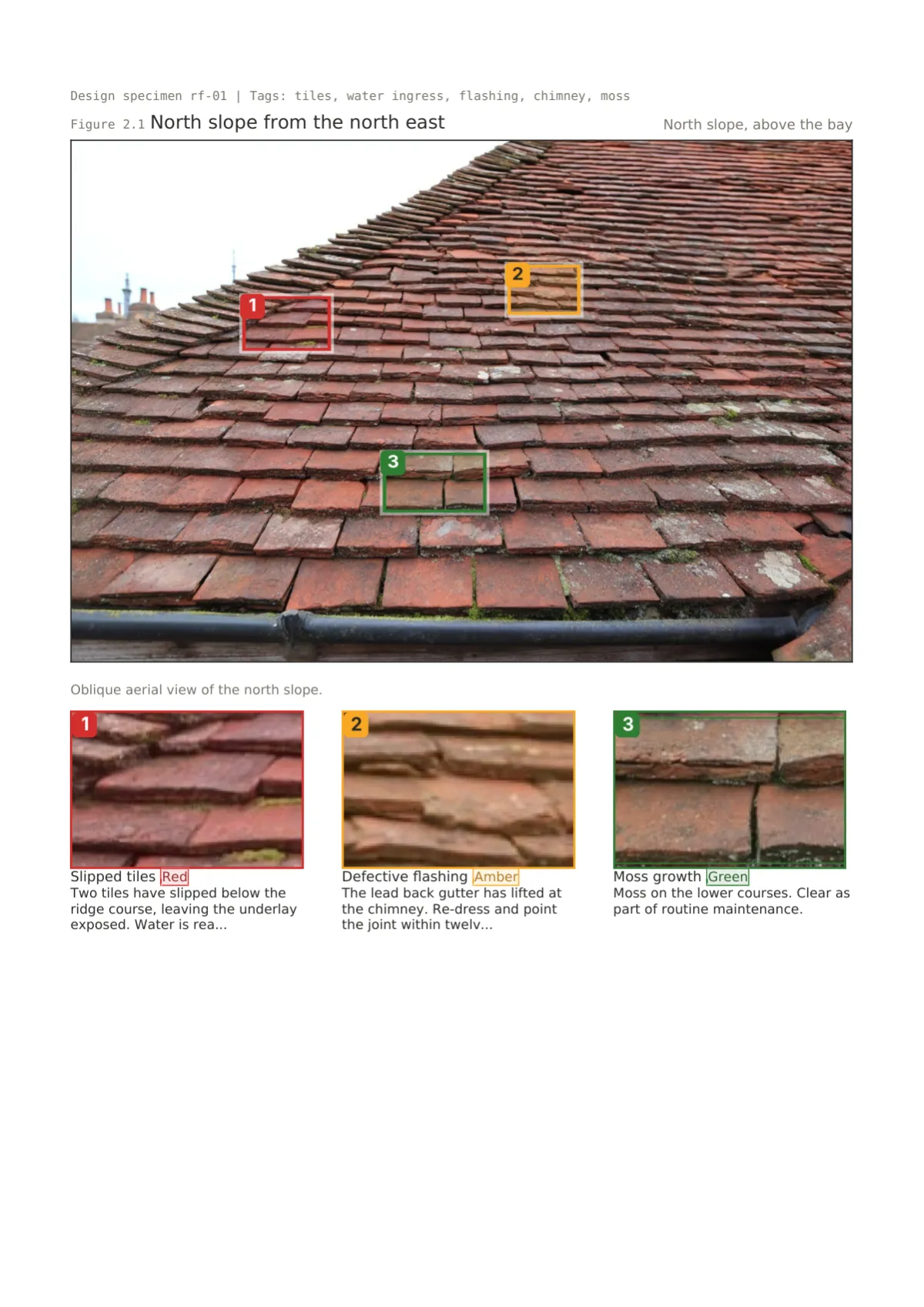
A font and a colour picker do not make a report easier to read. What does is the layout: whether the cover tells the reader the count before they open the document, whether a rating is a roundel a home buyer recognises or a mono code an engineer trusts, whether the defect photograph sits beside its crops or three pages away, whether a table shows its units and marks which figures were computed. Each of the five designs below is a whole answer to those questions, built for a kind of reader. Drawing Office numbers everything like a drawing set. Folio reads like a published survey. Register is the even-handed legal schedule. Gridline is the engineering sheet with units in the headers. Fieldbook is the site record that leads with the photograph. Rating colours always come from the template’s scheme, so a red is red in every design.
The five designs
Pick a card to see the design’s element tour, the examples that use it and a sample PDF.
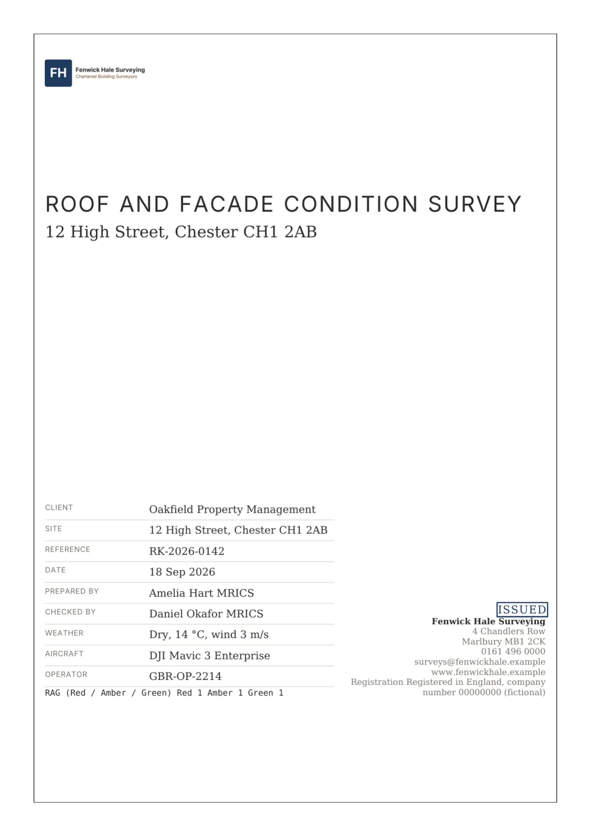
Cover
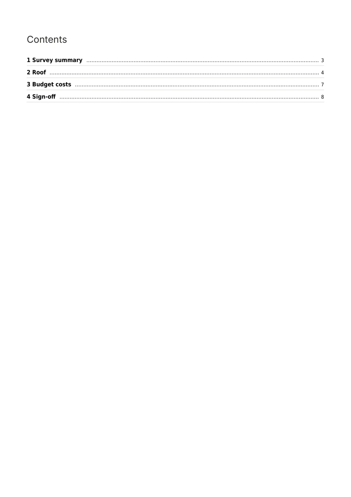
Contents
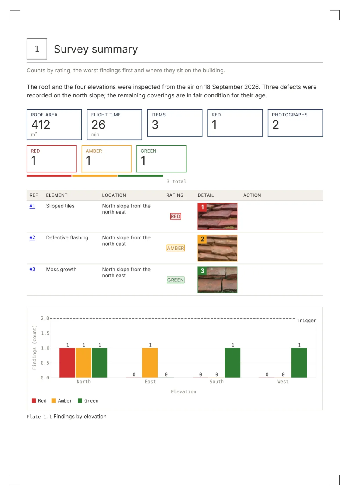
Summary
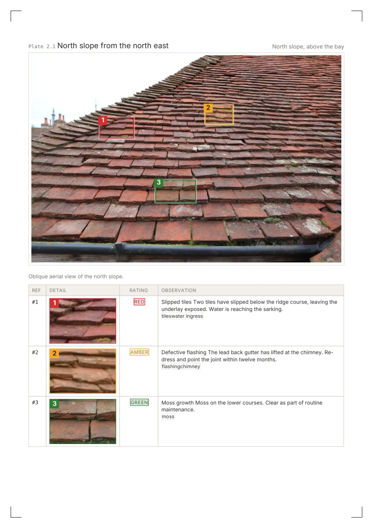
Plate page
Table page
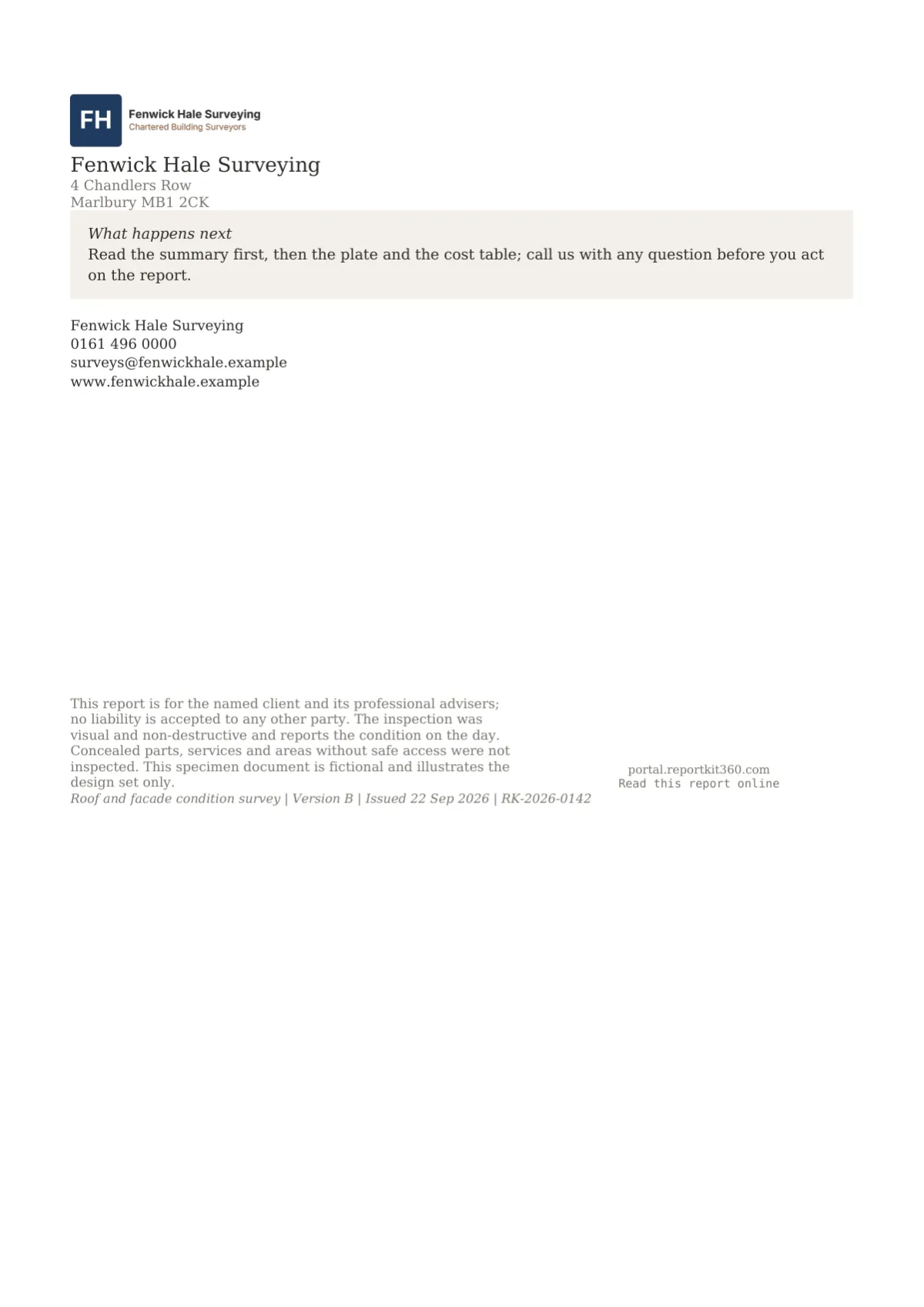
Back page
Technical due diligence, structural inspections, condition schedules and technical reports
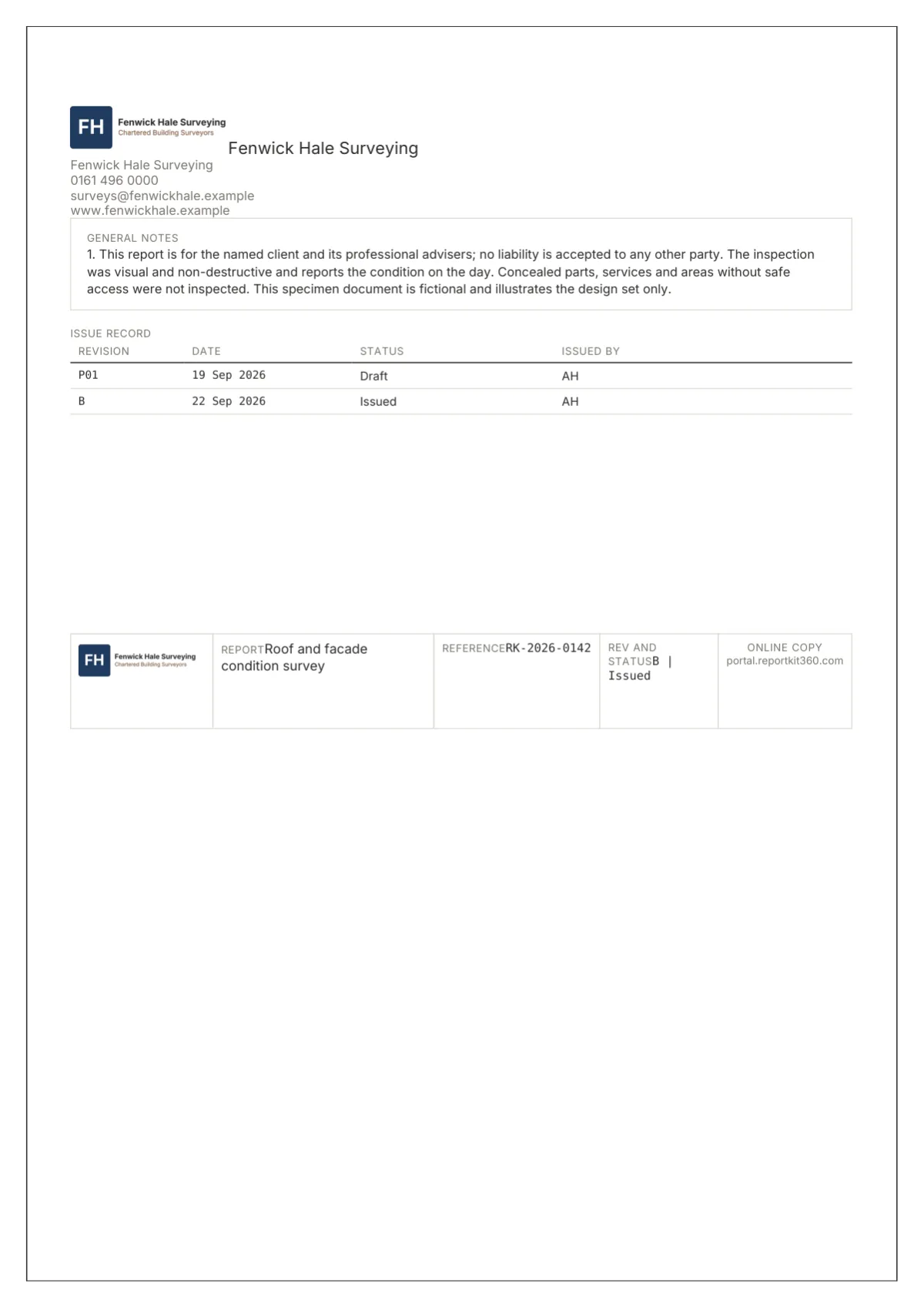
Cover
Contents
Summary
Plate page
Table page
Back page
RICS-style home surveys at levels 1 to 3, heritage reports and anything a lay client reads
Cover
Contents
Summary
Plate page
Table page
Back page
Dilapidations, lease schedules of condition and party wall schedules
Cover
Contents
Summary
Plate page
Table page
Back page
Thermography, solar PV verification, stockpile volumes and M and E reporting
Cover
Contents
Summary
Plate page
Table page
Back page
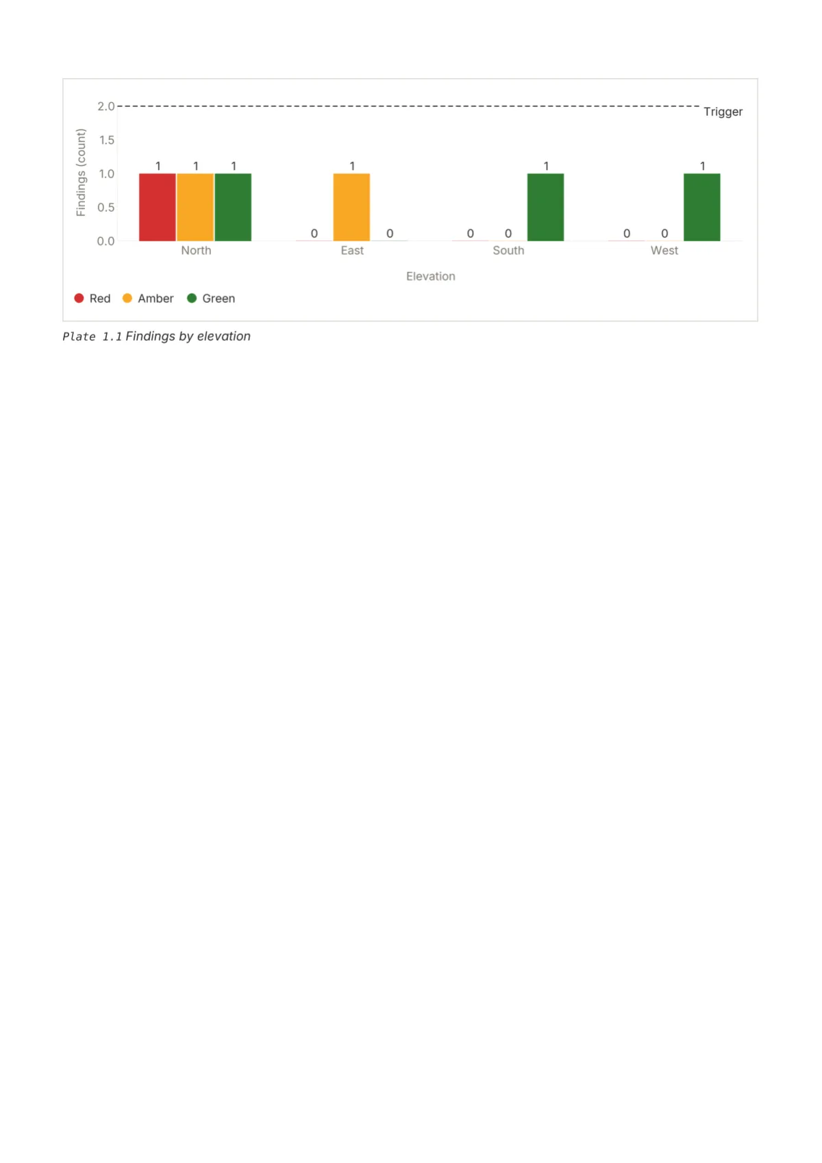
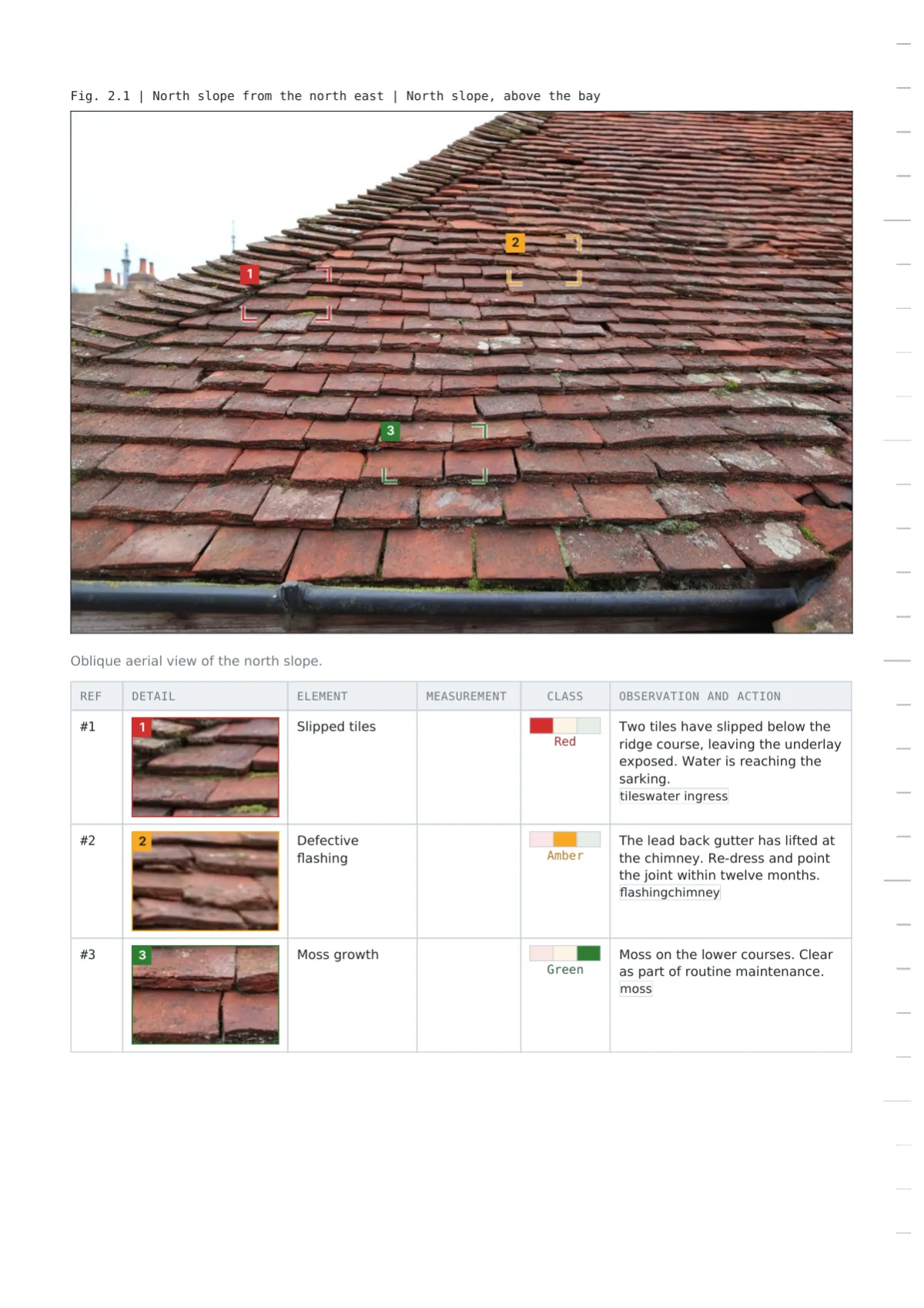
Drone surveys, roof and facade RAG inspections, snagging and access audits
Comparison
Design
Cover
Rating element
Photo evidence
Tables
Suits
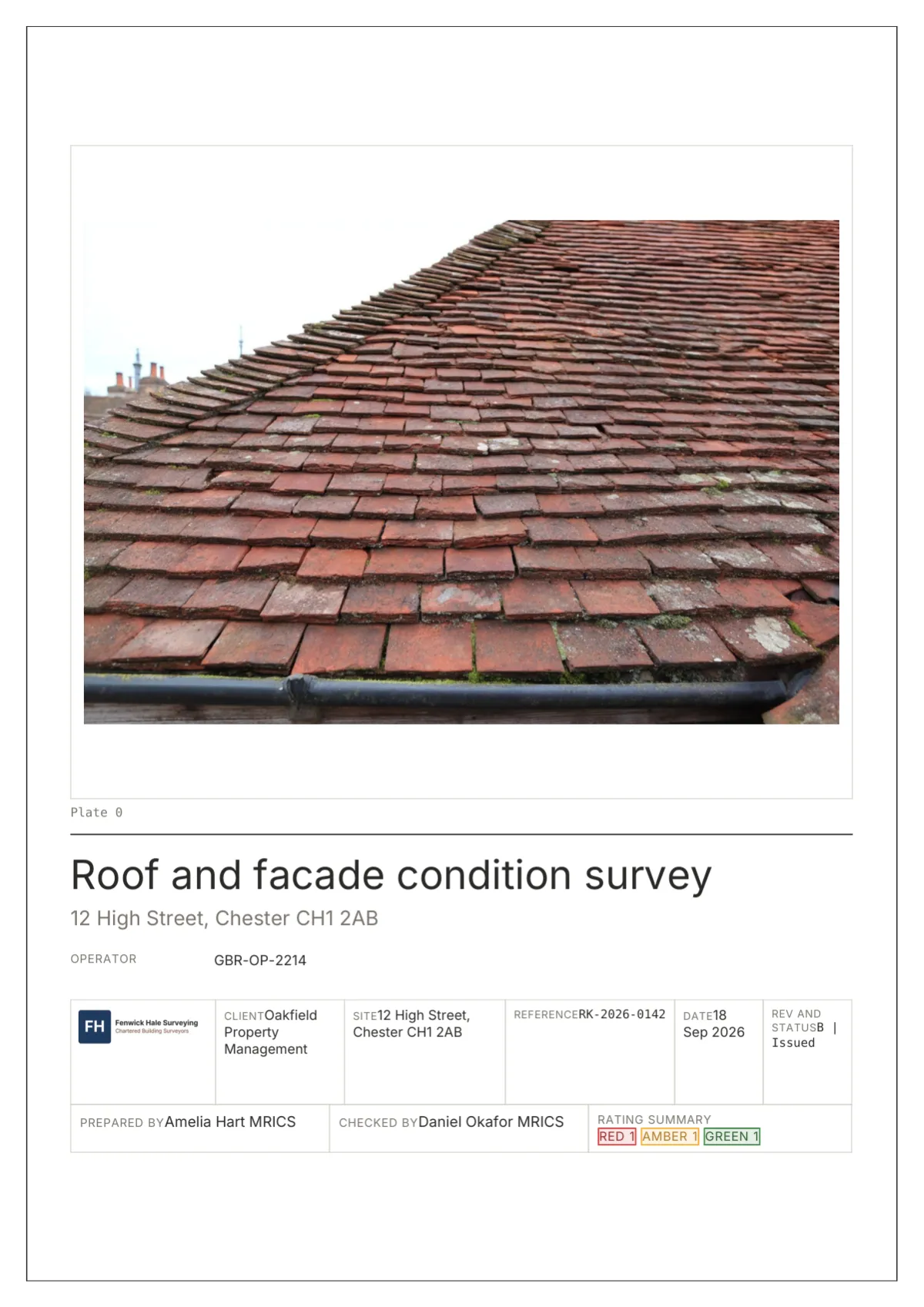
Drawing Office
Title block with the photograph as Plate 0
Stamp: outlined box with a tracked label
Plate with a plate schedule of 38 mm crops
Ruled, unit line, calculated marked, double-rule totals
TDD, structural, technical
Folio
Mounted photograph with a serif title stack
Roundel: 7 mm filled circle with the numeral
Plate with a crop list of 48 mm crops
Serif zebra in Inter, totals on a primary rule
Home surveys, lay readers
Register
Framed facts, no photograph, status stamp
Tile: 6 mm square, worst class solid
Ink-stroked photograph with a crop table
Boxed, response columns blank, calculated in colour
Dilapidations, schedules of condition
Gridline
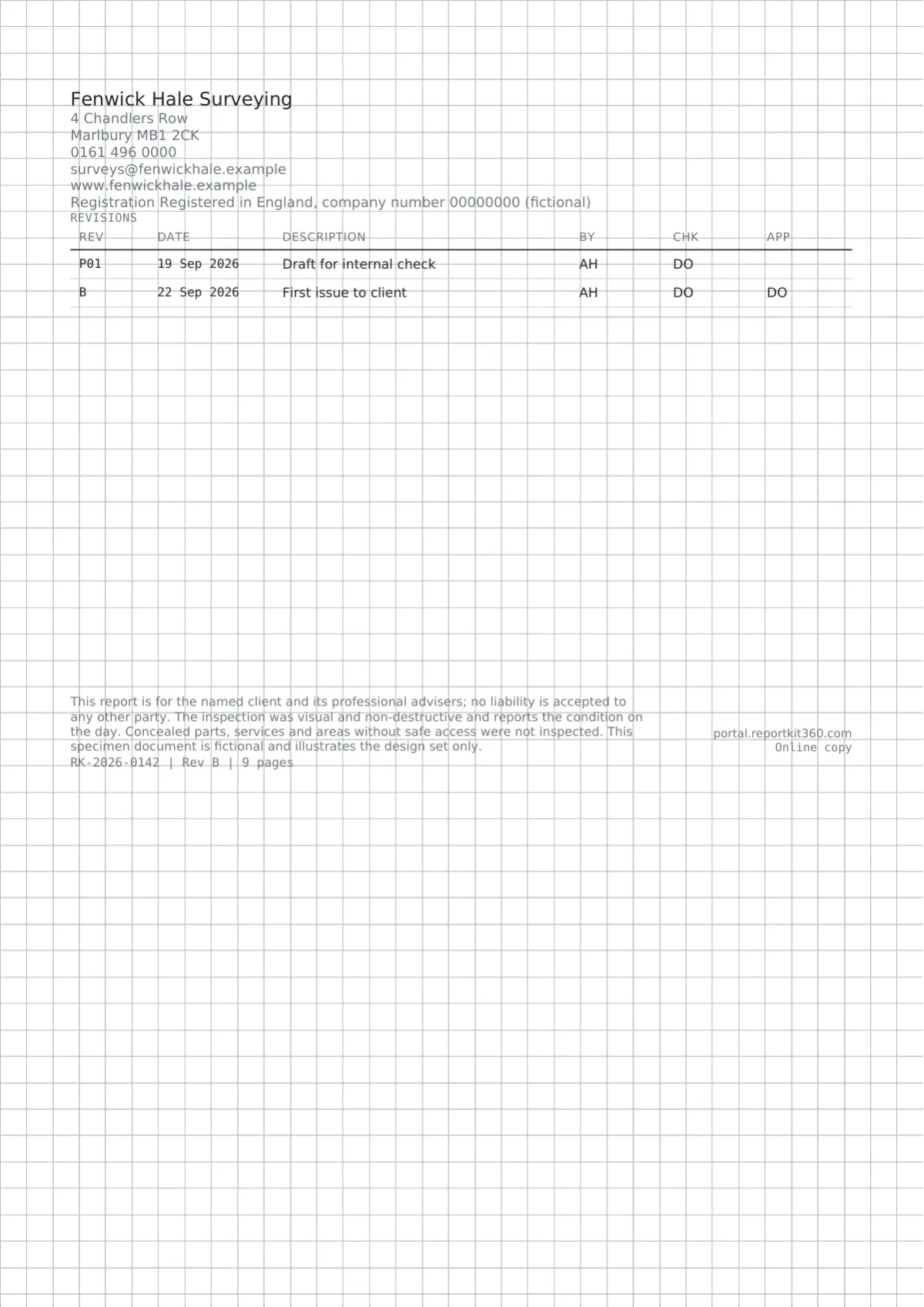
Control sheet on graph paper with Fig. 0.1
Scale band with a mono code
Corner marks with a grid table and measurements
Full grid, units under headers, shaded calculated cells
PV, thermography, stockpiles
Fieldbook
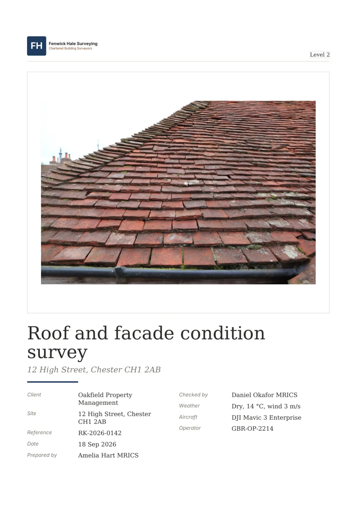
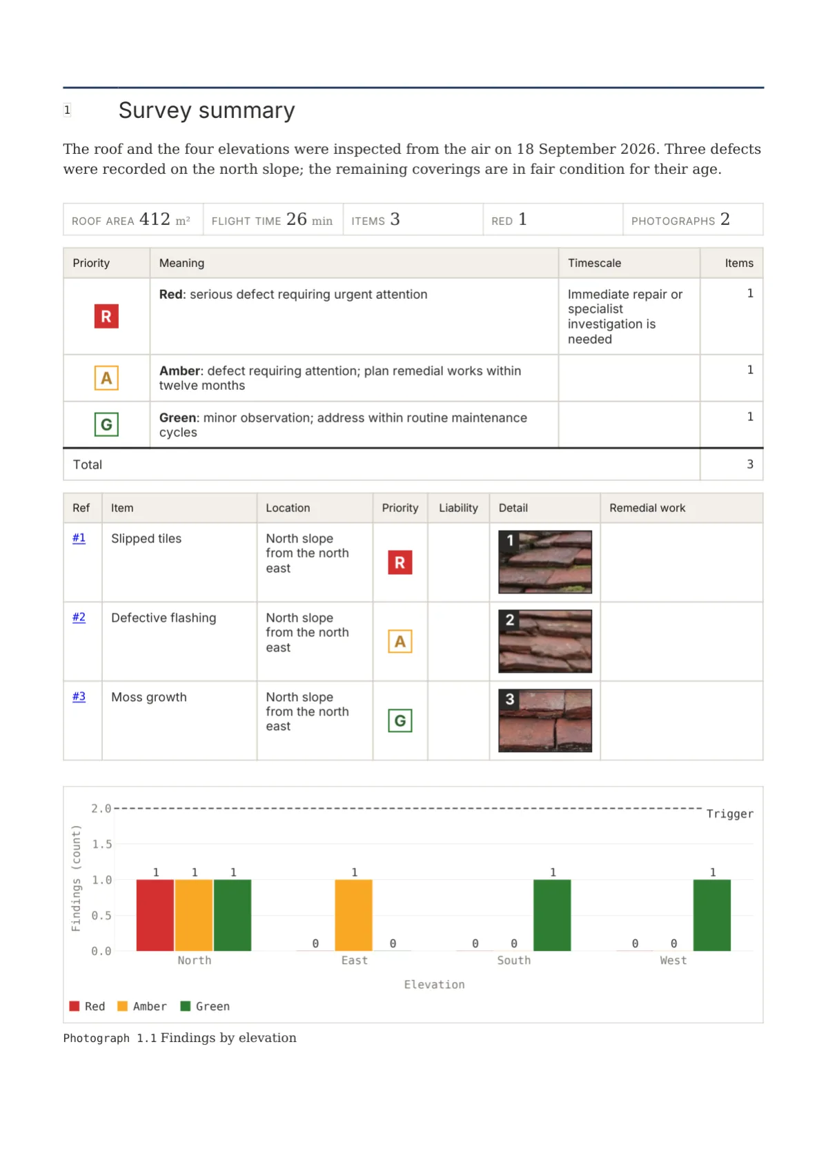
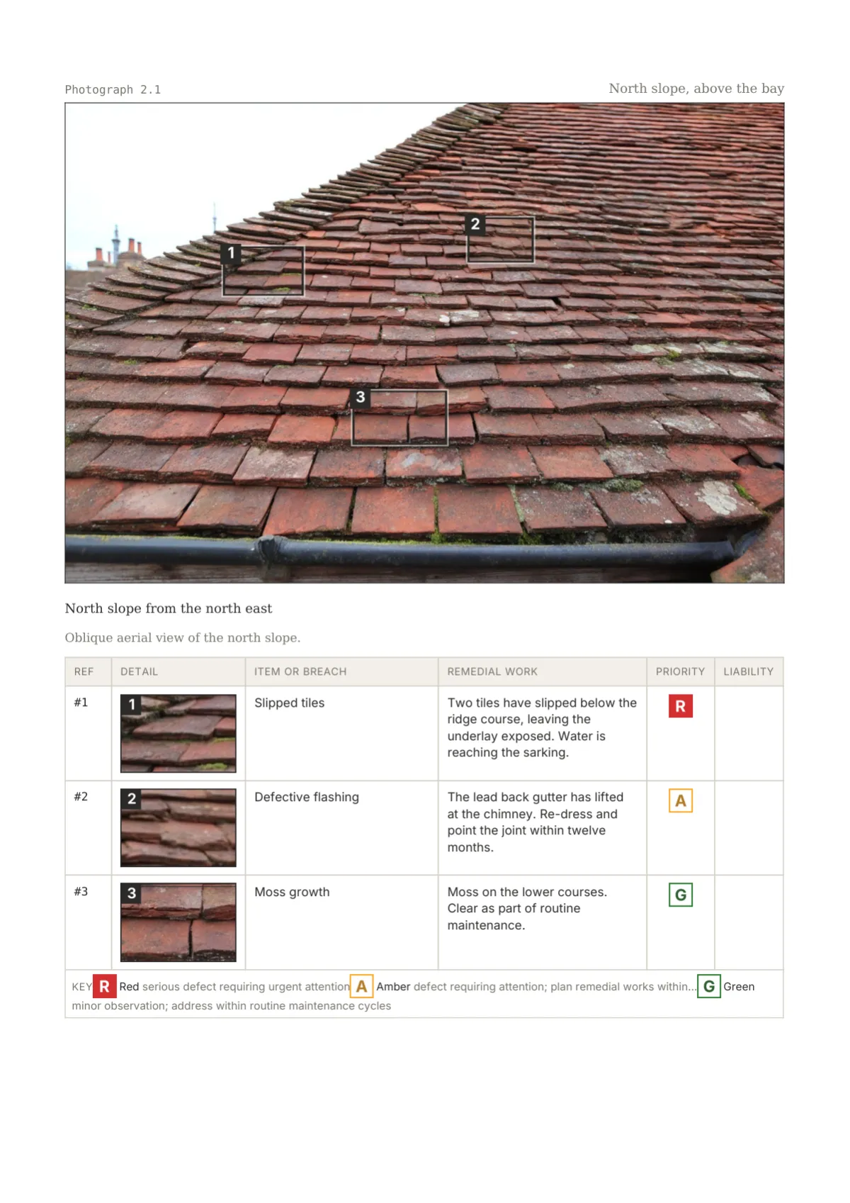
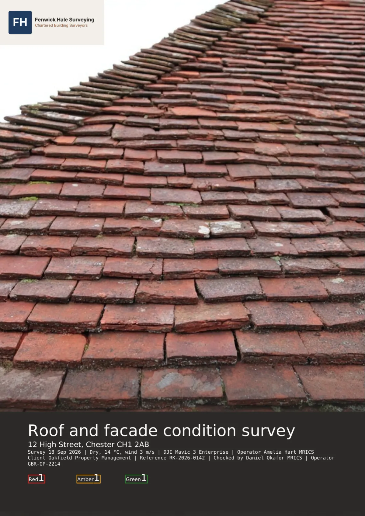
Full-bleed photograph with an ink band and count tiles
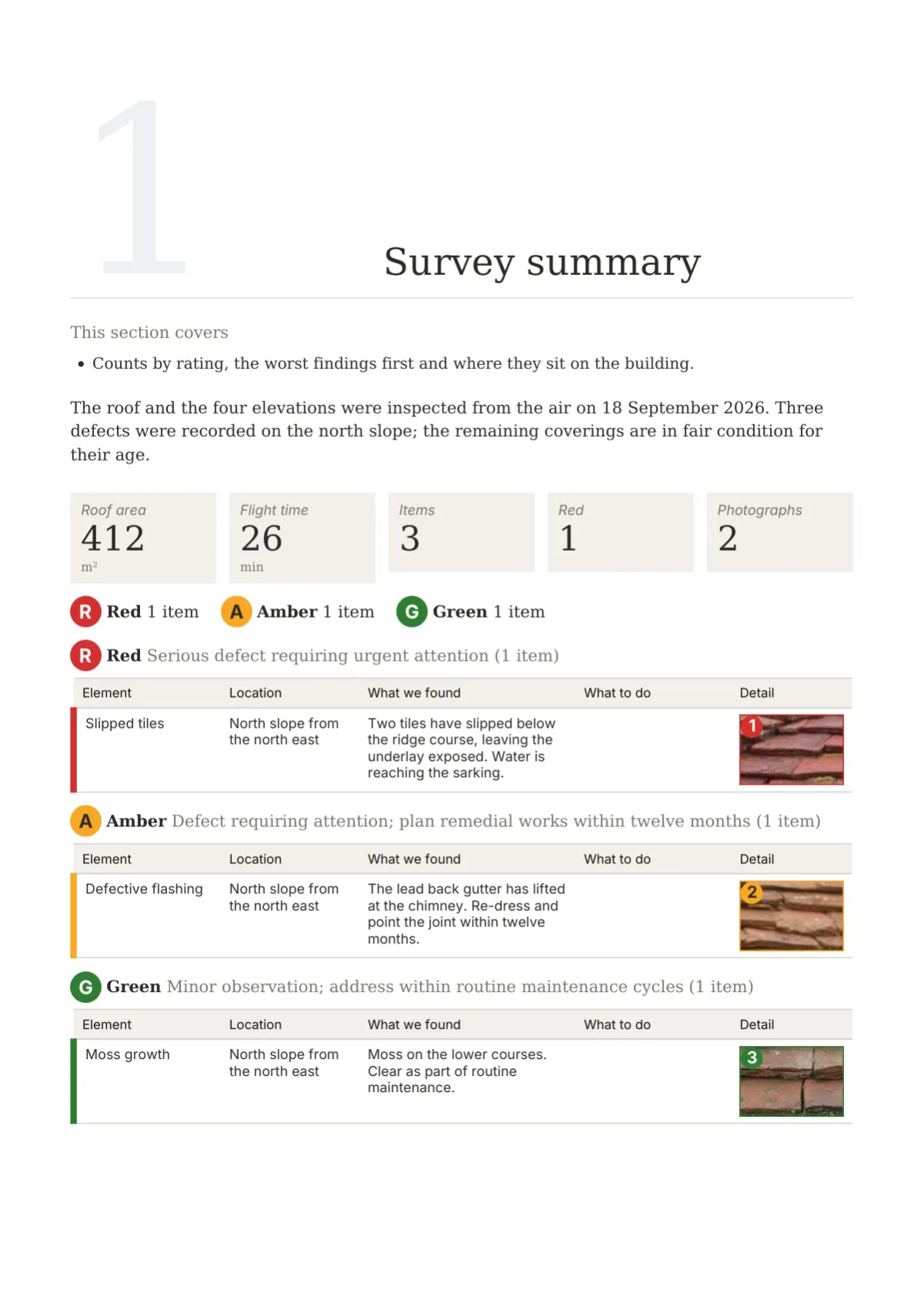
Tag: chip with a dot and sentence-case label
Metadata strip and a filmstrip of 54 mm crops
Ink header, zebra rows, calculated in colour
Roof, drone, snagging, access audits
How design sets work
Every template has a default design, and every report can switch to any of the five in its Design step. On Basic you pick a set, upload your logo and choose a primary colour, and the set places them: in the title block, on the mount tab, inside the frame, under the cover rule or on the band. The Report Kit 360 mark takes a set-specific position on the cover and a footer strip. On Pro you can clone a set into a custom theme and change any element independently: the rating badge, the table style, the section opener, the chart style, the paper, the back page, the header and footer. Cream paper is a Pro option on Folio and Fieldbook. Six older system themes remain available for existing reports under Classic themes.
See them in use
Questions
Yes. All five sets are available on both plans. On Basic you choose the set, add your logo and primary colour and, where a set offers one, a page word such as Sheet. The Report Kit 360 mark stays in its set-specific position. Pro adds cloning a set to change individual elements, cream paper and a secondary colour.
Nothing changes. The six earlier system themes keep rendering exactly as before and remain selectable for reports that already use them, listed under Classic themes. The Design step suggests a matching design set for each, such as Folio for the serif theme, but switching is a choice you make per report; nothing migrates automatically.
No. Red, amber and green, condition ratings 1 to 3, grades A to D, CoA 1 to 3 and every other class take their colours from the template’s rating scheme. A design set changes the shape the colour appears in, a stamp, roundel, tile, scale band or tag, and how counts and summaries are drawn, never the colour itself.
Yes. One renderer produces both, so the cover, openers, tables, rating elements and photograph pages are the same in a browser as in print, including the frames and backgrounds behind them. Only pagination differs, because the share page scrolls; running heads and page numbers belong to the PDF.
Next step
Pick a plan, add your logo, and issue your first report today.